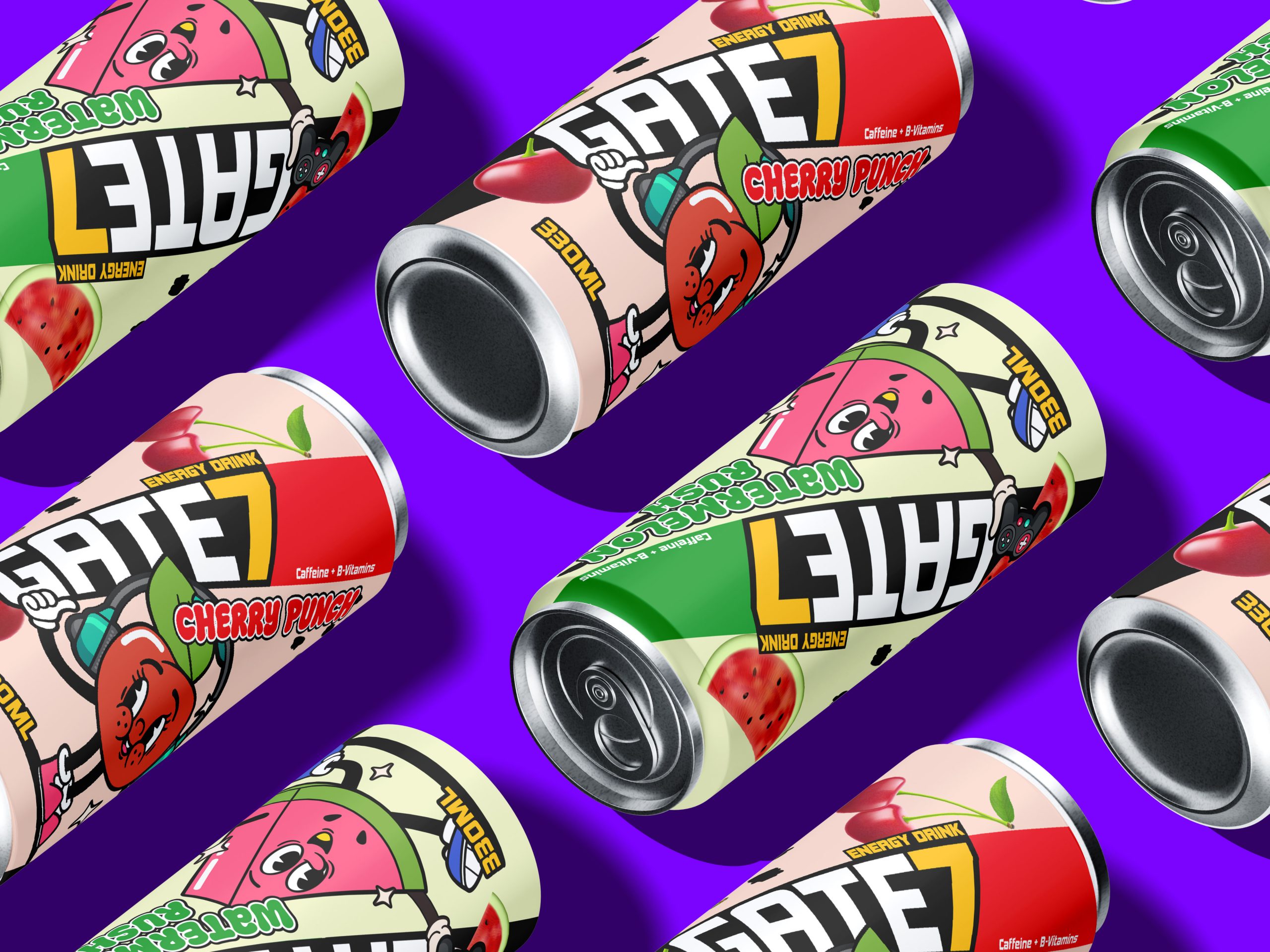
Project
Cherry Punch – Experimental Branding Project
Adobe Illustrator, Photoshop, Figma, After Effects
The taglines, “Sauce Brings Gloss” and “We Take Sauce Very Seriously,” highlight the transformative power of their salsa brava and their dedication to delivering a remarkable culinary experience. Overall, the identity embodies its youthful spirit through an exciting series of illustrations and an expressive/old-style typography. Barnas aims to stand out as a brand that offers a refreshing and enjoyable option for food enthusiasts seeking organic and tasteful choices.

From the beginning, GATE7 was made for gamers, streamers, and young creators — the ones who live in color, chase energy at midnight, and click “next episode” when the world says sleep.
I didn’t want it to look like any other energy drink. So I flipped the script:
Colors? Loud, playful, unapologetic. Each flavor has its own energy — neon greens, juicy reds, bold purples — all balanced with shadowy blacks for a hint of mystery and that “geek-culture dark mode” vibe.
Font? Funky, punchy, and readable. A typographic nod to early-2000s cartoons with a street-style edge.
Mascots? Hell yes. Each fruit got a character — not just for show, but to create a real universe. Think: collectibles, merch, motion graphics. This is more than packaging. It’s a playground.
Can layout? Vertical logotype, strong left-to-right reading, with a splash of chaos to keep your eyes bouncing around like in a good arcade game.